Holy crap, it's been a long time since I've done one of these!
As you may know, I'm committed to introducing many less-read comics to the masses. Since moving to Lansing and patronizing the Capital Area District Library, I've been able to read an enormous number of amazing comics and graphic novels that I wouldn't have had a chance to read otherwise. CADL has an extensive graphic novel section, the largest I've ever seen (granted, I haven't been to too many libraries), and it's an honor and a privilege to plug them whenever possible.
So, without further hairdo...I mean, ado...on to the comics!
1. 7 Miles a Second (Vertigo 1996; Fantagraphics 2013)
Written by David Wojnarowicz
Illustrated by James Romberger and Marguerite Van Cook.

7 Miles a Second pulses with rage as David looks back on his childhood hustling on the streets of New York, and forward to his eventual death of AIDS. The artwork is a primal, visceral scream of tumbling bioindustrial fragments and loud colors bounded by shaky lines, fully expressing the grimy, predatory, chewed-up New York City that is now almost a memory. Pulpy as a derelict's dumpster sandwich, raw as a cracked tooth, Beat as a mad whiskey-reeking prophet, 7 Miles a Second is a provocative and gut-wrenching read.
2. Blacklung (Fantagraphics)
Chris Wright

This one haunted me. Chris Wright weaves a doom-filled tale of buccaneers, mysticism, and society's dregs through the use of nearly-abstract muppet-like creatures. The denizens of his novel are reminiscent of blobby, stitched-together sea creatures living a thousand fathoms down, and the whole experience of the book is one of intense pressure and suffocating blackness, punctuated by moments of indescribable violence and cruelty. Somehow the mutilations and suffering are made all the more powerful by his vaguely goofy character designs. The story follows a jaded schoolteacher in a Dickensian dockside town; together with a local brute, the schoolteacher is shanghaied onto a pirate boat, where he meets the captain, Brahm, and his psychotic first mate, Sweany (a character who actually turned my stomach). Becoming Brahm's amanuensis, the schoolteacher must find a way to survive his term aboard the Hand even as they sail ever deeper into damnation. The story is one part Conrad, two parts Melville, and all sheer narrative power.
3. Le ciel au-dessus du Louvre (The Sky Over the Louvre)
Bernard Yslaire, Jean-Claude Carriere
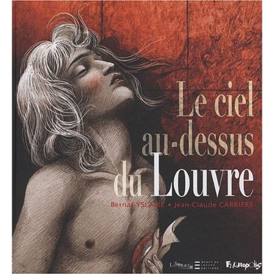
Now of course I can't read French, so maybe I didn't catch all the subtle nuances of the writing in the English translation; still, it didn't seem to detract from the story. The Sky Over the Louvre follows the tale of David, the great painter of the French Revolution, his fraught relationship with dictator Maximilien Robespierre, and the influence of the male model, "Jules" over the tormented artist. Robespierre commissions David to paint the "Martyr for the Revolution" Bara, a boy who died in the French civil wars following the revolution; but his real obsession is the Supreme Being, a deification of Reason intended to replace religion in the minds of the people. But David's own infatuation with his painting of Bara, and the angelic young man he hires to depict him, soon drive a wedge between the two revolutionaries. The Terror eventually eats up both Jules and Robespierre himself, leaving only a shattered David in its wake.
The art for this one is simple, yet effective: the design of the characters echo the sketch-cartoons done by painters before they apply pigment, while the paintings themselves are direct reproductions. Apparently this book is the second of a series of graphic novels intended to tell the story of the Louvre through its history, and in a cheeky way serves as a catalogue for the gallery's paintings. The characterizations are excellent, showcasing the French love of caricature, while at the same time humanizing the protagonists - even the megalomaniacal Robespierre. It's a poignant tale about two kinds of artists - one of paint, the other of ego - and the obsessions that will ultimately doom them both.
4. Beauty

Written by Hubert
Illustrated by Kerascoet
Another French comic, another English translation. Beauty follows the tradition of Tin Tin in combining simple, cartoon character designs, beautifully illustrative settings, and mature writing to tell its story. Coddie is an astonishingly ugly girl in a Ruritanian village who is granted the gift of extreme beauty by Mab, exiled queen of the Fairies. Her abrupt change sets off a series of calamitous events as she moves from one kingdom to the next, inflaming passions and jealousies and leaving a trail of destruction in her wake. The story is a fairy tale in the true sense: not an antiseptic Disneyfication, nor a cynically-winking "Fractured Fairy Tale", but a real story about a real woman, with real consequences. The magic is eerie and ambiguous, the kings and princes as fickle or honorable as any human. It's the Gallic pragmatism and graphic sense of the novel I find the most charming.
5. The Bloody Streets of Paris
Adapted from 120 Rue de la Gare by Leo Malet
Illustrated by Jacques Tardi

Another French gem, this time a noir following the exploits of flatfoot Nestor Burma during the German occupation of France in WWII. While a prisoner in a Nazi POW camp, Burma is intrigued by an amnesiac whose dying words are "Tell Helene...120 Rue de la Gare!" Once released, Nestor sees his old colleague Bob, who repeats the mysterious address before being gunned down on the train platform. His hunt for Helene and the address leads him through the twisting physical and psychological terrain of Paris and Lyons, all under the menacing cloud of Nazi occupation.
Tardi is yet another French artist whose work at once charms and thrills through the use of cartoon characters over realistic background, in this case heavily-researched scenes of wartime France. In his adaptation of Leo Malet's detective novel, he doesn't adhere slavishly to the text, which is the stark just-the-facts-ma'am patter of classic noir, but lets his imagery wander over rich interior and exterior details. Some of the most poignant scenese depict Burma and his colleagues passing in front of pro-Vichy and -German posters marked by wrathful graffiti; then Tardi slyly inserts a notice offering a reward for his own arrest. It reminds us how freighted any depiction of occupied France becomes for the French themselves: the idea that their country was complicit with the Nazis remains one of immense national shame, inversely proportional to their pride in the Free French Resistance. Tardi here identifies himself as one of those who would resist all enslavement and tyranny with art and arms.
I'm useless at following detective novels of any kind; there's always about ten characters too many, and as for the plot twists, I just have to go on the author's word at the end of it all that he wrapped things up nice and tidy. As usual though, it's not the puzzle itself, but the puzzle-solver who intrigues us. Nestor Burma is a classic Noir man - unsmiling, sardonic, normally reserved but dangerous in a fight. His pipe is reminiscent of Sherlock; his gun, Bogie. And of course there's dames a-plenty. Tardi gives his women unidealized faces, while somehow making them sultry and untrustable.
I should probably leave off French comics for a bit - three in a row is a bit much - but they're just so much fun.
5. Locke & Key series (IDW)
Written by Joe Hill
Illustrated by Gabriel Rodriguez
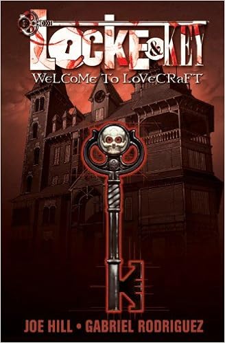
This story follows the adventures of Tyler, Kinsey, and Bode Locke and their return to Keyhouse after the death of their father. They soon discover a series of magical keys, which unlock strange new abilities. However, a demonic presence haunts Keyhouse, and wishes to use the keys - and the Locke children - to its own nefarious ends.
Overall, I really liked Locke & Key. I'm a sucker for anything Lovecraftian to begin with, and in this story in particular, I couldn't wait to flip through and find out what all the keys did - they're the best part of the story. At the same time, I have several major quibbles with the series. Gabriel Rodriguez's depictions of the characters, while suitably creepy at the right moments and hilarious in others, also tends toward annoyingly hammy. It has to do with a certain blankness around the eyes, which necessitates a lot of facial EMOTING during the serious scenes. I propose a drinking game for every time a character weeps in this series; you'd get suitably smashed by the middle of book one, as they take the slightest excuse to gush like saline fountains.
This is compounded by the fact that the series is all about teenagers and their so-very-interesting teenager problems. The writing is at its best during those quietly tense, illustratively static moments - I call them "duplicate panel" moments - when a casual conversation is freighted with dramatic irony. It's at its absolute nadir when the teenagers are discussing their problems, which they do at length; the writing flattens hammer-tappingly dull cliche while Mr. Rodriguez tries to salvage the scene with constipated grimaces and oceans of tears. Sure, teenagers are dramatic, whatever...but at least make them individually dramatic, each with their own buttons to push and manners of expressing themselves, not as histrionic windup toys.
Which brings me to the writing itself, the style and diction, if you will: there I was, reading happily along, and suddenly I ran into my first "ayuh". Odd, I thought, checking the credits again. That's a Stephen King phrase. As I continued, the subtle cues began to accumulate. It not only read like King, it felt like King. What's going on? I thought, thoroughly spooked; was "Joe Hill" merely a pseudonym, like Richard Bachman? Turns out, Joe Hill is the son of Stephen King...sort of a mini-me, actually. Writes like dad. Looks like dad. Probably the result of some Lovecraftian soul-switching experiment a la "The Thing on the Doorstep", by which Mr. King intends to live forever. I even found one bit of dialogue, toward the end of the series, that was lifted verbatim from The Green Mile (see if you can find which one). While I do like King's works, seeing his style copied almost exactly by his son, complete with all the annoying quirks, was annoying at best.
6. The Wicked + The Divine (Image)
Written by Kieron Gillen
Illustrated by Jamie McKelvie

I included this one not because I like it, but because other people have - it won Best Comic at the 2014 British Comic Awards, and was nominated for the 2015 Eisner Awards in the Best New Series, Best Cover Artist, and Best Coloring categories. And yes, the art is great; I can appreciate the stylishness, and the coloring is indeed excellent, with its simple solids zapped in dazzling neons. Very "now", in other words. Very, very "now".
Okay, before I start griping, here's the plot: the present world is host to a bunch of reincarnated deities called "The Pantheon" who use their powers for fame and influence. For instance, there's Amaterasu, a magical pop singer; The Morrigan, a multiply-personalitied underground magical pop singer; and Luci, a female incarnation of Lucifer who does...stuff. Protagonist-fodder Laura, an ordinary mortal (OR IS SHE?!!! sorry...), just loves these pantheon types, because oh gosh you guys they're so keen, and wants to hang out with them forever. Or something. Hijinks ensue, peoples' heads explode, and other stuff happens.
So points for originality: the gods come back, and guess what? They're celebrity personalities. Nice critique of current celebrity obsession, and there's a discussion of fame in the current smartphone culture. After the novelty wears off, however, things shift back into Dull gear: the series is basically a vampire soap opera, full of sexy superpowered morally-ambiguous folk and their bombastically boring immortal problems. So maybe it's just me and my lack of enthusiasm for this kind of dreck, but it also comes down to the way the initial clever conceit gets overwhelmed by subpar storytelling ability. In these cases I imagine a once-smug writer, now panicked by the fact that his pilot episode was greenlighted when he hadn't thought much past the pitch.
Now, I'm an admitted Anglophile to a certain extent; there's lots of great British pop art, especially comics and television. There's also a certain British trashiness that crops up every once in a while, that I can't quite put my finger on, but every time I see it or read it I want to pour boiling tea into my skull. Perhaps it's a certain super-slick stylishness, even in the supposedly "punk" characters; or a jarring jump-cut sensibility to the narrative flow; or the lifelessly blunt sexuality. I've noticed it in (God help me) such sacred cows as Sherlock, or Torchwood. It's in The Wicked + The Divine, too. American trash is bad, but it's at least somewhat self-aware; British trash has no sense of irony that I can figure out.
So for those reasons and others, I couldn't really finish The Wicked + The Divine, just skim through it and look at the pretty pictures. Maybe it's just not for me? Read it and see if it deserves all those awards.
More reviews to come, hopefully sooner than later.
Rick Out!
As you may know, I'm committed to introducing many less-read comics to the masses. Since moving to Lansing and patronizing the Capital Area District Library, I've been able to read an enormous number of amazing comics and graphic novels that I wouldn't have had a chance to read otherwise. CADL has an extensive graphic novel section, the largest I've ever seen (granted, I haven't been to too many libraries), and it's an honor and a privilege to plug them whenever possible.
So, without further hairdo...I mean, ado...on to the comics!
1. 7 Miles a Second (Vertigo 1996; Fantagraphics 2013)
Written by David Wojnarowicz
Illustrated by James Romberger and Marguerite Van Cook.
7 Miles a Second pulses with rage as David looks back on his childhood hustling on the streets of New York, and forward to his eventual death of AIDS. The artwork is a primal, visceral scream of tumbling bioindustrial fragments and loud colors bounded by shaky lines, fully expressing the grimy, predatory, chewed-up New York City that is now almost a memory. Pulpy as a derelict's dumpster sandwich, raw as a cracked tooth, Beat as a mad whiskey-reeking prophet, 7 Miles a Second is a provocative and gut-wrenching read.
2. Blacklung (Fantagraphics)
Chris Wright
This one haunted me. Chris Wright weaves a doom-filled tale of buccaneers, mysticism, and society's dregs through the use of nearly-abstract muppet-like creatures. The denizens of his novel are reminiscent of blobby, stitched-together sea creatures living a thousand fathoms down, and the whole experience of the book is one of intense pressure and suffocating blackness, punctuated by moments of indescribable violence and cruelty. Somehow the mutilations and suffering are made all the more powerful by his vaguely goofy character designs. The story follows a jaded schoolteacher in a Dickensian dockside town; together with a local brute, the schoolteacher is shanghaied onto a pirate boat, where he meets the captain, Brahm, and his psychotic first mate, Sweany (a character who actually turned my stomach). Becoming Brahm's amanuensis, the schoolteacher must find a way to survive his term aboard the Hand even as they sail ever deeper into damnation. The story is one part Conrad, two parts Melville, and all sheer narrative power.
3. Le ciel au-dessus du Louvre (The Sky Over the Louvre)
Bernard Yslaire, Jean-Claude Carriere
Now of course I can't read French, so maybe I didn't catch all the subtle nuances of the writing in the English translation; still, it didn't seem to detract from the story. The Sky Over the Louvre follows the tale of David, the great painter of the French Revolution, his fraught relationship with dictator Maximilien Robespierre, and the influence of the male model, "Jules" over the tormented artist. Robespierre commissions David to paint the "Martyr for the Revolution" Bara, a boy who died in the French civil wars following the revolution; but his real obsession is the Supreme Being, a deification of Reason intended to replace religion in the minds of the people. But David's own infatuation with his painting of Bara, and the angelic young man he hires to depict him, soon drive a wedge between the two revolutionaries. The Terror eventually eats up both Jules and Robespierre himself, leaving only a shattered David in its wake.
The art for this one is simple, yet effective: the design of the characters echo the sketch-cartoons done by painters before they apply pigment, while the paintings themselves are direct reproductions. Apparently this book is the second of a series of graphic novels intended to tell the story of the Louvre through its history, and in a cheeky way serves as a catalogue for the gallery's paintings. The characterizations are excellent, showcasing the French love of caricature, while at the same time humanizing the protagonists - even the megalomaniacal Robespierre. It's a poignant tale about two kinds of artists - one of paint, the other of ego - and the obsessions that will ultimately doom them both.
4. Beauty
Written by Hubert
Illustrated by Kerascoet
Another French comic, another English translation. Beauty follows the tradition of Tin Tin in combining simple, cartoon character designs, beautifully illustrative settings, and mature writing to tell its story. Coddie is an astonishingly ugly girl in a Ruritanian village who is granted the gift of extreme beauty by Mab, exiled queen of the Fairies. Her abrupt change sets off a series of calamitous events as she moves from one kingdom to the next, inflaming passions and jealousies and leaving a trail of destruction in her wake. The story is a fairy tale in the true sense: not an antiseptic Disneyfication, nor a cynically-winking "Fractured Fairy Tale", but a real story about a real woman, with real consequences. The magic is eerie and ambiguous, the kings and princes as fickle or honorable as any human. It's the Gallic pragmatism and graphic sense of the novel I find the most charming.
5. The Bloody Streets of Paris
Adapted from 120 Rue de la Gare by Leo Malet
Illustrated by Jacques Tardi
Another French gem, this time a noir following the exploits of flatfoot Nestor Burma during the German occupation of France in WWII. While a prisoner in a Nazi POW camp, Burma is intrigued by an amnesiac whose dying words are "Tell Helene...120 Rue de la Gare!" Once released, Nestor sees his old colleague Bob, who repeats the mysterious address before being gunned down on the train platform. His hunt for Helene and the address leads him through the twisting physical and psychological terrain of Paris and Lyons, all under the menacing cloud of Nazi occupation.
Tardi is yet another French artist whose work at once charms and thrills through the use of cartoon characters over realistic background, in this case heavily-researched scenes of wartime France. In his adaptation of Leo Malet's detective novel, he doesn't adhere slavishly to the text, which is the stark just-the-facts-ma'am patter of classic noir, but lets his imagery wander over rich interior and exterior details. Some of the most poignant scenese depict Burma and his colleagues passing in front of pro-Vichy and -German posters marked by wrathful graffiti; then Tardi slyly inserts a notice offering a reward for his own arrest. It reminds us how freighted any depiction of occupied France becomes for the French themselves: the idea that their country was complicit with the Nazis remains one of immense national shame, inversely proportional to their pride in the Free French Resistance. Tardi here identifies himself as one of those who would resist all enslavement and tyranny with art and arms.
I'm useless at following detective novels of any kind; there's always about ten characters too many, and as for the plot twists, I just have to go on the author's word at the end of it all that he wrapped things up nice and tidy. As usual though, it's not the puzzle itself, but the puzzle-solver who intrigues us. Nestor Burma is a classic Noir man - unsmiling, sardonic, normally reserved but dangerous in a fight. His pipe is reminiscent of Sherlock; his gun, Bogie. And of course there's dames a-plenty. Tardi gives his women unidealized faces, while somehow making them sultry and untrustable.
I should probably leave off French comics for a bit - three in a row is a bit much - but they're just so much fun.
5. Locke & Key series (IDW)
Written by Joe Hill
Illustrated by Gabriel Rodriguez
This story follows the adventures of Tyler, Kinsey, and Bode Locke and their return to Keyhouse after the death of their father. They soon discover a series of magical keys, which unlock strange new abilities. However, a demonic presence haunts Keyhouse, and wishes to use the keys - and the Locke children - to its own nefarious ends.
Overall, I really liked Locke & Key. I'm a sucker for anything Lovecraftian to begin with, and in this story in particular, I couldn't wait to flip through and find out what all the keys did - they're the best part of the story. At the same time, I have several major quibbles with the series. Gabriel Rodriguez's depictions of the characters, while suitably creepy at the right moments and hilarious in others, also tends toward annoyingly hammy. It has to do with a certain blankness around the eyes, which necessitates a lot of facial EMOTING during the serious scenes. I propose a drinking game for every time a character weeps in this series; you'd get suitably smashed by the middle of book one, as they take the slightest excuse to gush like saline fountains.
This is compounded by the fact that the series is all about teenagers and their so-very-interesting teenager problems. The writing is at its best during those quietly tense, illustratively static moments - I call them "duplicate panel" moments - when a casual conversation is freighted with dramatic irony. It's at its absolute nadir when the teenagers are discussing their problems, which they do at length; the writing flattens hammer-tappingly dull cliche while Mr. Rodriguez tries to salvage the scene with constipated grimaces and oceans of tears. Sure, teenagers are dramatic, whatever...but at least make them individually dramatic, each with their own buttons to push and manners of expressing themselves, not as histrionic windup toys.
Which brings me to the writing itself, the style and diction, if you will: there I was, reading happily along, and suddenly I ran into my first "ayuh". Odd, I thought, checking the credits again. That's a Stephen King phrase. As I continued, the subtle cues began to accumulate. It not only read like King, it felt like King. What's going on? I thought, thoroughly spooked; was "Joe Hill" merely a pseudonym, like Richard Bachman? Turns out, Joe Hill is the son of Stephen King...sort of a mini-me, actually. Writes like dad. Looks like dad. Probably the result of some Lovecraftian soul-switching experiment a la "The Thing on the Doorstep", by which Mr. King intends to live forever. I even found one bit of dialogue, toward the end of the series, that was lifted verbatim from The Green Mile (see if you can find which one). While I do like King's works, seeing his style copied almost exactly by his son, complete with all the annoying quirks, was annoying at best.
6. The Wicked + The Divine (Image)
Written by Kieron Gillen
Illustrated by Jamie McKelvie
I included this one not because I like it, but because other people have - it won Best Comic at the 2014 British Comic Awards, and was nominated for the 2015 Eisner Awards in the Best New Series, Best Cover Artist, and Best Coloring categories. And yes, the art is great; I can appreciate the stylishness, and the coloring is indeed excellent, with its simple solids zapped in dazzling neons. Very "now", in other words. Very, very "now".
Okay, before I start griping, here's the plot: the present world is host to a bunch of reincarnated deities called "The Pantheon" who use their powers for fame and influence. For instance, there's Amaterasu, a magical pop singer; The Morrigan, a multiply-personalitied underground magical pop singer; and Luci, a female incarnation of Lucifer who does...stuff. Protagonist-fodder Laura, an ordinary mortal (OR IS SHE?!!! sorry...), just loves these pantheon types, because oh gosh you guys they're so keen, and wants to hang out with them forever. Or something. Hijinks ensue, peoples' heads explode, and other stuff happens.
So points for originality: the gods come back, and guess what? They're celebrity personalities. Nice critique of current celebrity obsession, and there's a discussion of fame in the current smartphone culture. After the novelty wears off, however, things shift back into Dull gear: the series is basically a vampire soap opera, full of sexy superpowered morally-ambiguous folk and their bombastically boring immortal problems. So maybe it's just me and my lack of enthusiasm for this kind of dreck, but it also comes down to the way the initial clever conceit gets overwhelmed by subpar storytelling ability. In these cases I imagine a once-smug writer, now panicked by the fact that his pilot episode was greenlighted when he hadn't thought much past the pitch.
Now, I'm an admitted Anglophile to a certain extent; there's lots of great British pop art, especially comics and television. There's also a certain British trashiness that crops up every once in a while, that I can't quite put my finger on, but every time I see it or read it I want to pour boiling tea into my skull. Perhaps it's a certain super-slick stylishness, even in the supposedly "punk" characters; or a jarring jump-cut sensibility to the narrative flow; or the lifelessly blunt sexuality. I've noticed it in (God help me) such sacred cows as Sherlock, or Torchwood. It's in The Wicked + The Divine, too. American trash is bad, but it's at least somewhat self-aware; British trash has no sense of irony that I can figure out.
So for those reasons and others, I couldn't really finish The Wicked + The Divine, just skim through it and look at the pretty pictures. Maybe it's just not for me? Read it and see if it deserves all those awards.
More reviews to come, hopefully sooner than later.
Rick Out!
Comments